I would like peeps to have a look at the home page for our local hero HEMIDUTY.
I have never done this before so i would like some feed back on the home page which i will host for the next 48 hrs before taking it down and developing the rest of the site.
The ultimate aim is to gain him some sponsorship so if some one in the know can give some tips it helps anyway have a look at the home page and provide some feed back none of the links work atm Q: is the page enticing? does it want you to look futher ?? Q:what do you want to look for on the page any way click on the link http://users.tpg.com.au/bhhj4578/hemi.2.2home.html and decide foryourself and provide some feed back both positive and negative
thanks
I need some opinions on a web site
-
Sulli
- KSRC Contributor

- Posts: 1096
- Joined: Tue Jun 21, 2005 7:12 pm
- Bike: ZX9R
- State: Queensland
- Location: Brisbane/southside
I need some opinions on a web site
Nostradamus probably got it right
-
dave#3
- Team Ninja
- Posts: 3098
- Joined: Mon Apr 26, 2004 7:11 pm
- Bike: Z1000
- State: New South Wales
- Location: Kyogle, NSW
- Contact:
Sulli,
It's great to see you putting something together for veggie-slapper, I understand he needs all the financial help he can get and I think it's a credit to you to be doing something like this to help him out.
Having said that, though, the website looks pretty amateur and very 90's (probably early 90's). I'm far from convinced that flash and graphic intensive websites are all they're cracked up to be but I think it's important to at least look modern and slick.
Some examples of better racer websites (IMO, bring on the flames ) are:
http://www.caseystoner.com.au/
http://www.chrisvermeulen.com/about.html
Also, I notice the site looks much better in IE than in Firefox; you should check the site in as many browsers as possible, especially considering you are using M$ Frontpage to develop it.
Sorry to be negative
It's great to see you putting something together for veggie-slapper, I understand he needs all the financial help he can get and I think it's a credit to you to be doing something like this to help him out.
Having said that, though, the website looks pretty amateur and very 90's (probably early 90's). I'm far from convinced that flash and graphic intensive websites are all they're cracked up to be but I think it's important to at least look modern and slick.
Some examples of better racer websites (IMO, bring on the flames
http://www.caseystoner.com.au/
http://www.chrisvermeulen.com/about.html
Also, I notice the site looks much better in IE than in Firefox; you should check the site in as many browsers as possible, especially considering you are using M$ Frontpage to develop it.
Sorry to be negative
dave#3 | '03 z1000 roadie | '08 zx6r tracky | '03 KLX400R dirty
http://www.oz4x4.net/gallery2
Winner - KSRC Murphy's Law Award 2008
http://www.oz4x4.net/gallery2
Winner - KSRC Murphy's Law Award 2008
-
RG
- KSRC Contributor
- Posts: 1454
- Joined: Tue Nov 30, 2004 11:28 pm
- Bike: It's not worth Mentioning
- State: Western Australia
- Location: WA
Sulli, it is very nice of you to do that and I think you deserve a round of applause (and a beer on Hemi) 
I agree with dave#3,
 It is very 90s, something more 'modern' will be better.
Personally I prefer Stoner's website as it appears to be more inviting. Vermeulen's front page has got too much text, I won't want to read all that stuff on a front page, it'll be better off in a sub-section on it's own. Notice Stoner's page hasn't got much colour(except for the pic of course), it's mainly black and white. That pic caught my attention immediately, and if you want to head that way, we'll need a good pic of Hemi in that similiar fashion.
Hemi's page is not a 'bad' page, but there is definately room for improvement. This is going to take time, don't rush into it.
I believe there are a few professional web/IT people here to help.
Kepp it up Sulli!
I agree with dave#3,
Hemi's page is not a 'bad' page, but there is definately room for improvement. This is going to take time, don't rush into it.
I believe there are a few professional web/IT people here to help.
Kepp it up Sulli!
"...The credit belongs to the man who is actually in the arena." - Theodore Roosevelt
-
Stereo

- KSRC Addict

- Posts: 4578
- Joined: Thu Aug 11, 2005 8:01 am
- Bike: ZX10R
- State: Victoria
- Location: Pt Cook, Melbourne, Victoria, Australia, Pacific Ocean, Earth
Hi.... I have done some web design, a good idea is to start from a template.... PM me and I will send you some great templates
Have a look at one of my designs here http://www.melbikes.com
Have a look at one of my designs here http://www.melbikes.com
The world is round. It has no point.
-
Smitty

- VIP MEMBER

- Posts: 10914
- Joined: Wed Apr 21, 2004 1:59 pm
- Bike: ZX12R
- State: Victoria
- Location: 3rd rock from the Sun
- Contact:
StereoStereo wrote:
Have a look at one of my designs here http://www.melbikes.com
that page is blank
dns issue? what browsers it supoort?
edit[dns issue I reckon ..it now comes up
cheers
Last edited by Smitty on Mon Jun 26, 2006 8:21 am, edited 2 times in total.
GOTTA LUV the 12R!!
-
greenmeanie
- KSRC Contributor
- Posts: 1858
- Joined: Thu May 13, 2004 5:10 pm
- Bike: ZX10R
- State: Queensland
- Location: Ipswich QLD
-
greenmeanie
- KSRC Contributor
- Posts: 1858
- Joined: Thu May 13, 2004 5:10 pm
- Bike: ZX10R
- State: Queensland
- Location: Ipswich QLD
Works for me smitty on firefox.Smitty wrote:StereoStereo wrote:
Have a look at one of my designs here http://www.melbikes.com
that page is blank
dns issue? what browsers it supoort?
cheers
Glenn
2009 ZX10R
2009 ZX10R
-
photomike666
- Apprentice Post Whore :-)
")
- Posts: 5956
- Joined: Sat Jan 15, 2005 12:01 am
- Bike: ZX10R
- State: Victoria
- Location: Melbourne
- Contact:
Firstly, I am in agreement with most of the above comments, and think it's a great idea. To get sponsors the page needs to look corporate. Flash sites are usually the go, although old school java script can be good.
You have used a couple if images that are not of Hemi, particularly the bike in the top right pane. Where did you get that from? Do you own copyright to it? In a corporate world you cannot get away with using something without paying for it. The same may apply to the rotating symbol top centre.
To an extent, web design is fairly subjective. There are many designs, trends and accepted styles in use (or frowned upon), but personal preference as to what is best plays a large part. My preference is to have the first page with just enough info to entice people in, load quickly and not require any scrolling. Once inside the site, more information can then be gained from an easy to follow navigation that is always available.
Content is just as important. Who is the site aimed at, fans or sponsors? This will make a huge difference to the site design and what is contained within.
Tankslapper racing is very funny to fellow bikers, but what does it portray to sponsors? Would they feel that it suggests the bike is unprofessionally set-up?
hth
Mike
--------------------------------------------------------------------------------------------------------------
07 ZX10R since new, tracky TBA, KX450F, 87 CR250 restoration, GT MTB - I've got serious thrill issues, dude
07 ZX10R since new, tracky TBA, KX450F, 87 CR250 restoration, GT MTB - I've got serious thrill issues, dude
-
Sulli
- KSRC Contributor
- Posts: 1096
- Joined: Tue Jun 21, 2005 7:12 pm
- Bike: ZX9R
- State: Queensland
- Location: Brisbane/southside
Sorry can't do anything about the bananasgreenmeanie wrote:Poor bugger needs a banana & tyre supplier. The banana's are pretty pricey at the moment nearly as much as the tyres!
Am sending pm thanks for the helpstereo wrote:Hi.... I have done some web design, a good idea is to start from a template.... PM me and I will send you some great templates
I understand my mistakePhotomike wrote:You have used a couple if images that are not of Hemi, particularly the bike in the top right pane. Where did you get that from? Do you own copyright to it? In a corporate world you cannot get away with using something without paying for it. The same may apply to the rotating symbol top centre.
Yes I'm an amateurdave#3 wrote:Having said that, though, the website looks pretty amateur and very 90's (probably early 90's).
Thanks for the replies and the leads will keep you all posted
Nostradamus probably got it right
-
smek

- VIP MEMBER
- Posts: 1498
- Joined: Fri Jul 02, 2004 12:32 am
- Bike: ZX10R
- State: New South Wales
- Location: Chatswood, Sydney
Bad Points.
too colourfull. too many borders. and I'd get rid of the animating gifs.
Also the heading should probably be the same width as the main table. You may want to make them both 100% width so they'll scale to the browser window.
Images are too large. With the thumbnails I'd be aiming for around 20k max.
I assume you won't be using those big images either, since they're copyrighted.
Good points. The layout is quite good. I do find it inviting.
My suggestions.
Ok well it's your first site so i won't get too technical.
Cut down the colours. create a palette of maybe 6 colours that complement each other and pick them all from that.
Get some decent image manipulation software. ie photoshop. then remake all the graphics so they don't look like they've been made in ms paint.
Nice title is very important.
go for a minimalist look (get rid of all those table borders) and find another way to seperate the sections.
Nothing ground breaking there but it'll make the site look a hell of a lot better.
-
HemiDuty
- KSRC Contributor
- Posts: 1963
- Joined: Mon Mar 28, 2005 6:27 pm
- Bike: Don't have one
- State: Queensland
- Location: Brisbania
- Contact:
Good one Sulli and thanks for going to the effort of making that.
As for being the local hero, I think that title would probably go to Stretchy, he is faster than me ATM and will be racing at the national meeting in a couple of weeks. And there are quite a few of us racing now, but yeah I am still the only one with cool trendy long hair.
But anyway there are actually a couple of possibilities in the works right now, so it may be best to put it all on hold till I know what is happening. Nothing to get too excited about or anything, but still it may negate the point of a site like the one you have designed. Will keep you posted of any developments.
Thanks also to everyone's constructive opinions, at least Sulli now understands that he is living in the past.....
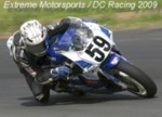
Drmsby Middleton
DC Racing
Extreme Motorsports
M2R
Castrol
ColourSmart Chroming
Hi Side Leathers
Teknic
Sidi
DID Racing Chain
Goodridge
DC Racing
Extreme Motorsports
M2R
Castrol
ColourSmart Chroming
Hi Side Leathers
Teknic
Sidi
DID Racing Chain
Goodridge
-
photomike666
- Apprentice Post Whore :-)
- Posts: 5956
- Joined: Sat Jan 15, 2005 12:01 am
- Bike: ZX10R
- State: Victoria
- Location: Melbourne
- Contact:
It would still be good to have a site to keep us all updated on your racing career, sponsored or not
--------------------------------------------------------------------------------------------------------------
07 ZX10R since new, tracky TBA, KX450F, 87 CR250 restoration, GT MTB - I've got serious thrill issues, dude
07 ZX10R since new, tracky TBA, KX450F, 87 CR250 restoration, GT MTB - I've got serious thrill issues, dude